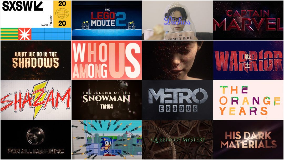
Title design
Blog I’m back with some heat for you guys. today we will discuss our movie title design. Since we are making an action-based film, we want our title to capture that aspect of the episode. While researching the different titles, we noticed that each film had something similar. All the titles had fast and engaging scenes. So we begin our series of titles looking back at how the opposition took away our main character's family member. When they are about to leave the scene, the main title of the scene will appear. After that, we looked at the main character, what happened to his family. Other titles will come later. The font is probably bold Areil in red. The red symbolizes the departure of his beloved and the revenge he will carry out. Tiles are likely to fade in and out. This is so that it does not become an obstacle. This gives the viewer enough time to watch it without dragging.
Comments
Post a Comment